Amolendu is an experienced design specialist with 18+ years of experience, he spent most of those years exclusively as a User Experience Designer (UX Designer) with major IT agencies and E-Commerce portals. He has worked on a variety of projects including financial and forex web and mobile apps, e-commerce, brand and marketing sites, financial dashboards; user-generated content, social networking, and on-demand mobile applications for various clients. Pepperfry.Com, Porsche, and Walmart are some of the clients he has worked with. Hailing from Mumbai, India, he is helping SaaS and tech start-ups with user and customer experience design via his company ONYX. In his free time, Amolendu loves to work as a short and ad filmmaker and he has won several awards for his film works and his short films have been selected in multiple prestigious film festivals around the globe.
Design emote in their ways, communicate and call for a reaction from the consumers. This could be a closed sale or a consumer shifting to a competitor site. User Experience is defined around various design experiences. The design platform is vast, considering creating experiences that can run beyond the scope of application. To make design a standard, relatable and definite experience, certain psychology principles are derived that designers should abide by.
In the light of these design psychology principles, designs can be decoded to create experiences that can be applied and interpreted as norms. Creating in the framework of design psychology helps to connect to clients as well as consumers equally and they understand the relevance of design output. There are numerous design principles, but the more ubiquitous are listed here.
Hick’s Law
The more the merrier does not apply under Hick’s law. Hick’s law is about taking a conservative and decluttered approach to make design simple and hence actionable. According to the law, the more the options you present to your consumers, the more time they take to decide.
Sites with minimalist designs appear promising, but how about their usability? What about sites that are heavy on content, how are those aligned and captured under Hick’s law? It is the designer’s skill to chunk and navigates the options under a smart infrastructure architecture, yet make the design appear simple and purposeful.
Psychology of Persuasion
Psychology of Persuasion very strongly and aptly captures the consumer responses bringing them to a call for action. The triggers introduced by persuasion are intriguingly response-oriented and therefore adapted by many designers.
Reciprocity: Reciprocity is creating indebtedness such that the consumer is obliged and comes back to shop. E.g. Offers and free vouchers.
Authority: Authority is making use of authoritative figures or celebrity endorsements to capture consumer interest.
Scarcity: Creating a deprived environment, which in turn triggers consumers to act fast. Timed sales, limited offers, stock clearances all work around the scarcity law.
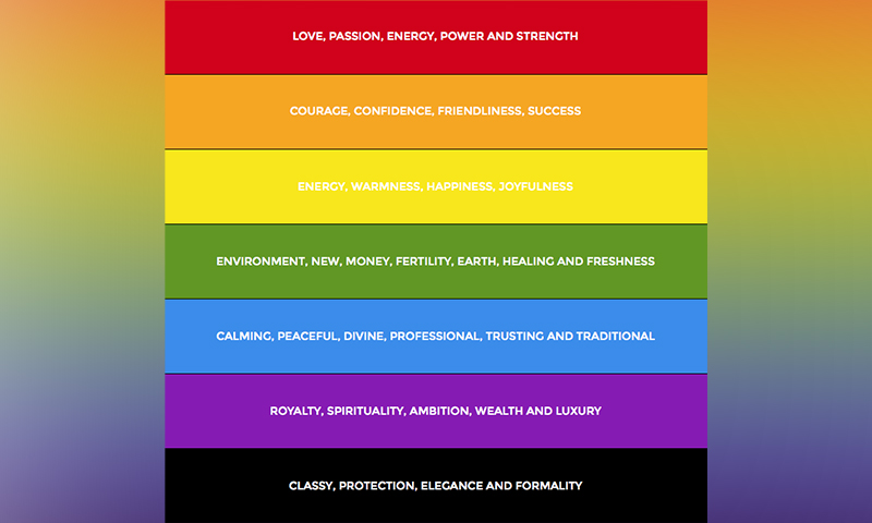
Psychology of Colours: What are you looking forth to drive? What is your purpose behind the design? Who is your target audience and what are their buying behavioural patterns? As a brand what do you wish to communicate to your audience? Colours come to influence the design and inspire a call to action. The deep and interesting psychology of colours can be adapted to convey brand value or to trigger sales.

Corporates bank on the blue colour symbolising professionalism and trust. Luxury and high-end products make the use of purple, while bold brands make their statement with Black.
Colours are also intelligently placed to create a call for action. Different colours have different impacts on the individual mind and help trigger or curtail actions.
Psychology of Shapes: Like Colours, our subconscious mind also reacts to different shapes by relating different qualities to different shapes. These are usually memory-based visual interpretations that we associate with certain qualities and have deep-set in our mind.

Gestalt Principles of Visual Perception
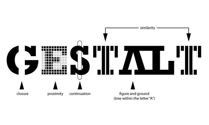
The Gestalt principle of perception states that elements placed together are perceived as one. The Gestalt Principle is narrowly classified under different principles:

Law of Symmetry: This design aspect uses symmetry in design to capture user experience.
Law of Proximity: Elements, when placed in closed proximity, gives the appearance of a design that is bold and captivating.
Law of Similarity: Similar objects when placed in closed proximity offer a united feel and this enhances the design in a certain dimension.
Law of Continuity: This law establishes a connection from one object in a design to another under a smooth and unaltered flow. Often represented by curved lines.
Law of Closure: Law of the closure means an incomplete object that is designed to perceive as complete.
Figure & Ground: This is a captivating representation of design where one image can be perceived in different forms.

Visceral Reactions: Why do you keep coming back to a shopping website often? Is it the product range or the product display, the ease of access, the convenience of controls? These all factors add to comforting results and hence you would want to get back to these sites often as compared to others. This is the visceral reaction of the website on you. Visceral reactions are a stimulus to designs and keep consumers coming back to your designs. Visceral reactions are highly creative and impactful designs that are explicitly built across user experiences. The elaborate elements like imagery, fonts, colours and graphic are used to enhance the design.
Von Restorff Effect
The selective distinction is the way the Von Restorff Effect works breaking the monotony. It is also known as Isolation effect. The design stands by making a visual distinction of an object such that it stands stark in contrast to the others making a memorable experience. This effect is created by working artistically around highlighting, altering colours, size, font or effect of the object that has to be distinguished to a call-to-action.

Von Restorff effect is usually seen in the call to action buttons that sit stark contrasting to the other elements in the design. In the above image subtly, the Von Restorff effect is the Free tab as opposed to the other two paid ones.
There are innumerable principles of design psychology including – Dual Coding Theory, Pareto Principle, Fitt’s Law, Mental Models, Memory Models, Memory Limitations, Selective Disregards and Change Blindness, Cognitive Load, Serial Position Effect etc. It is, after all, a choice of the designer to adapt to a principle that is befitting the consumer and stakeholder demands as well as can trigger a suitable call-for-action. While psychology principles of design help maintain a standard across the industry, it is also easy to make understand the stakeholders of the design element and expected results. These design principles are based around consumer decisions and design expectations and therefore drive towards effectively meeting the goals.


